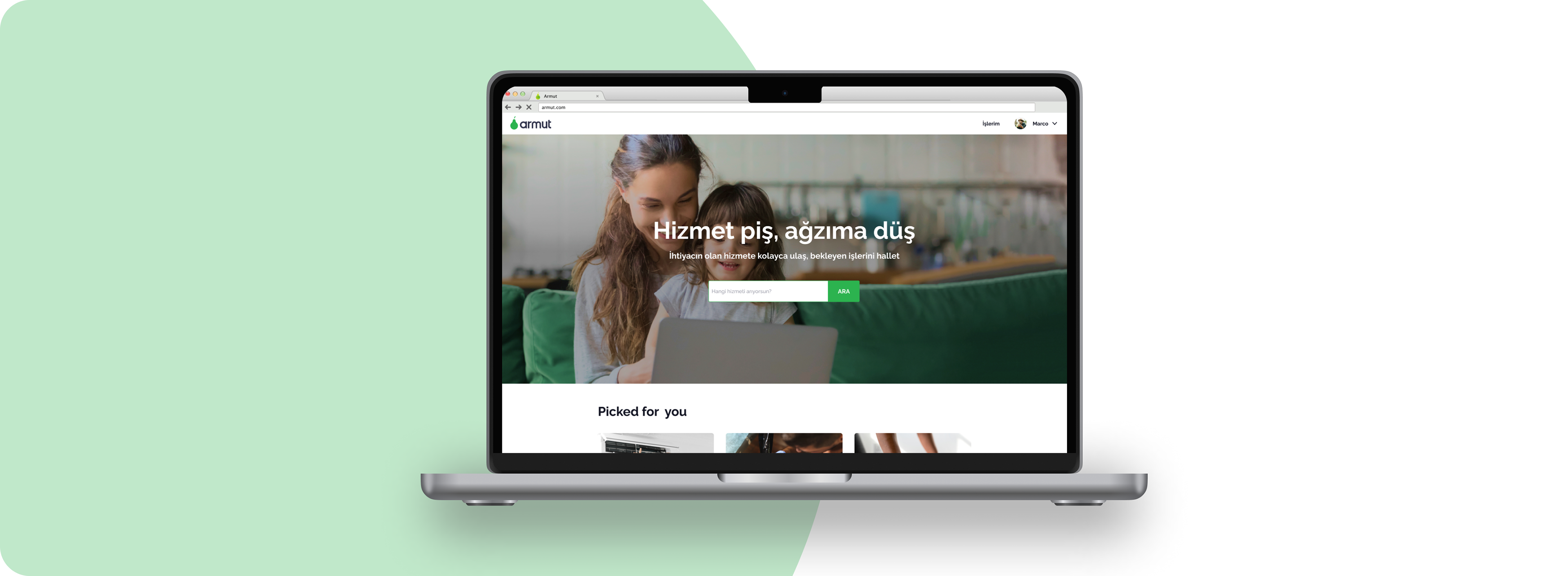
Logged-in Homepage Redesign Project
Exploratory process in redesigning the Armut homepage
As it often happens with fast growing marketplaces, the big majority of traffic and job requests we receive on Armut every day come from our SEO-focused pages and Pay-Per-Click pages (dynamically generated web pages that target long tail keywords). Because of this and our strategy to focus on low-hanging fruits with certain revenue improvements, we’ve been neglecting homepage-focused projects for years.
Since recently our offline marketing spending has been steadily increasing, organic traffic to our homepage is steadily increasing and we managed to build a case for a homepage redesign to understand its shortcomings and improve its quality.
While analyzing use cases for the homepage we spotted two core user segments:
• logged-out users, people that haven’t used Armut yet and will probably need a bit of explaining and a good sales pitch
• logged-in users, returning customers that need to either reach out professionals that they’ve already contacted, or create a new job request
Although the focus of this project was the logged-in experience, most of our findings and considerations are of general interest and will be considered for the logged-out experience as well.
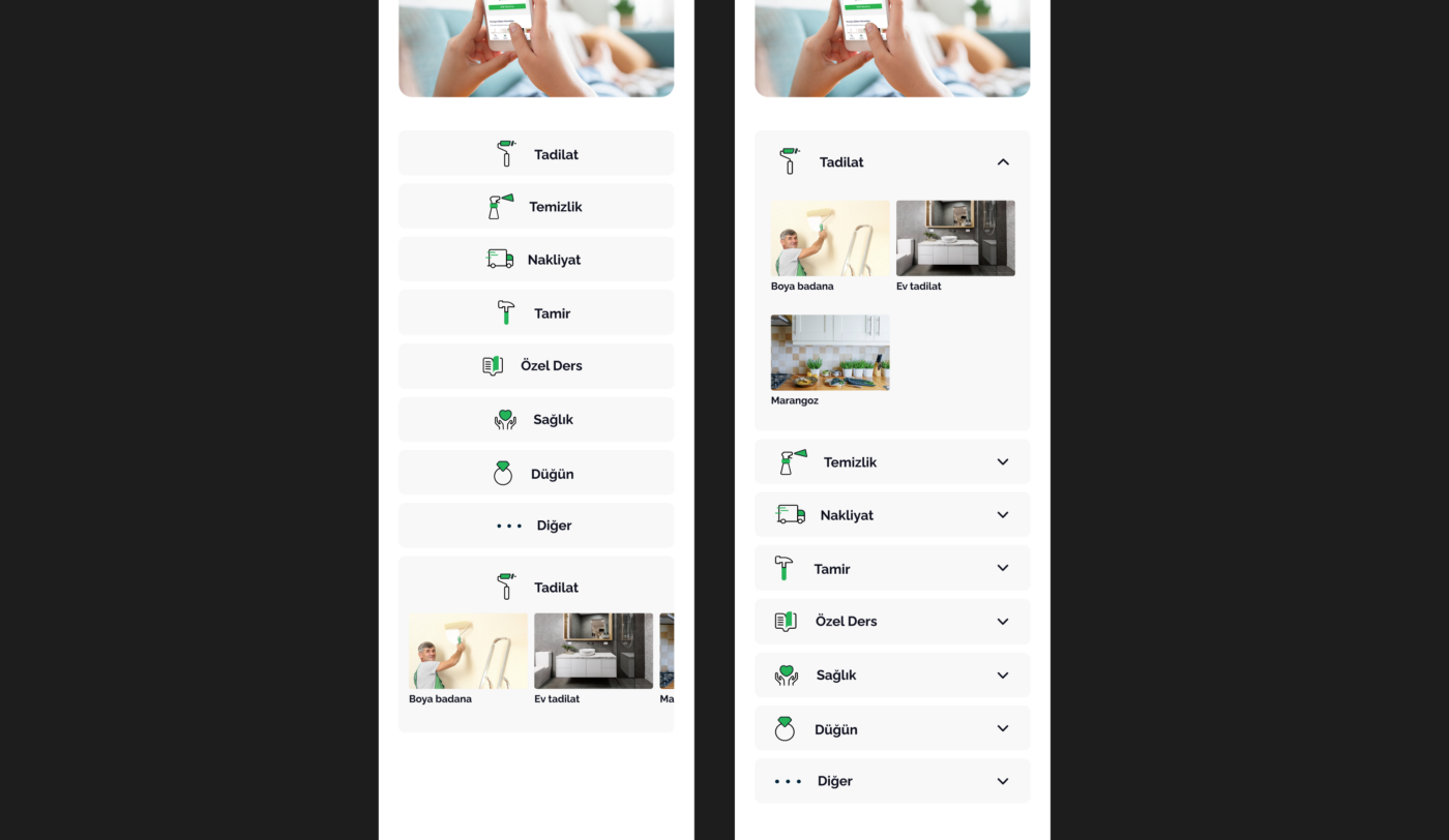
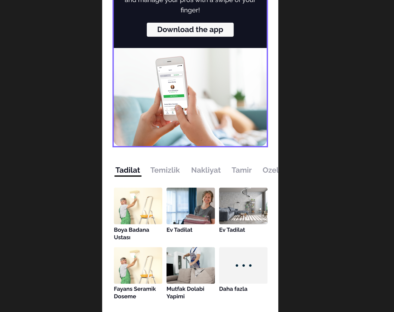
When we were creating different discovery models, we differentiated the options according to the way of how the user finds the desired service. We already had the ‘list everything’ model which displays all services at once. It’s already been used with horizontally scrolling rows for each category and it was a little bit exhausting to click continually on desktop or constantly scrolling on mobile devices. So, it was a need to make the discovery experience better.
Beside the ‘list everything’ method, we’ve defined three other models.
Progressive Disclosure: We called it ‘progressive’ because this helps us to put everything in their own drawer, instead of revealing it all over the whole page. It still displays all the services but at this time, the user should put out the drawer to pick. This extra step is exactly what makes the ‘list everything’ model ‘progressive’. Maybe it has one more interaction for users, but on the other hand, it really helps us to tidy up our thousands of services.
Curated Offer: This model enables users to find services within lists which have been created specifically for their needs and desires. Giving an example: One of these lists could be called ‘treat yourself’ and that list would show users services such as ‘massage’ or ‘manicure’. It’s also helpful if the user doesn’t know exactly what she/he needs. Thumbtack (www.thumbtack.com) uses this model.
Sorting Filtering: It’s an option to group services by their related main subject. For example, if there were a category named “Home”, you would see every service that is relevant to it. So, it’s possible to see services from different categories that we’re using currently.
Since we did not want to hide information from the users (in that case, it means increasing the number of displayed services) and didn’t want to confuse them by dividing and replacing the same type of services into different categories; ‘curated offer’ and ‘sorting filtering’ models were not in our focus. So, we work on a ‘progressive discovery’ model.
The first thing we wanted to do was hiding services under categories to prevent a cluttered experience. Accessing services only when the user wants to see would help. So, as it’s in the name of the model, the main idea was putting all these services one click away. There were multiple ways to do this…
Let’s see the different layouts for mobile devices first. In the example above, we can say that it’s not confusing in terms of the service discovery experience. A user can easily go with the flow with that option. But, on the downside; as being a list, it creates a huge block on a mobile screen. So, it should’ve been improved.
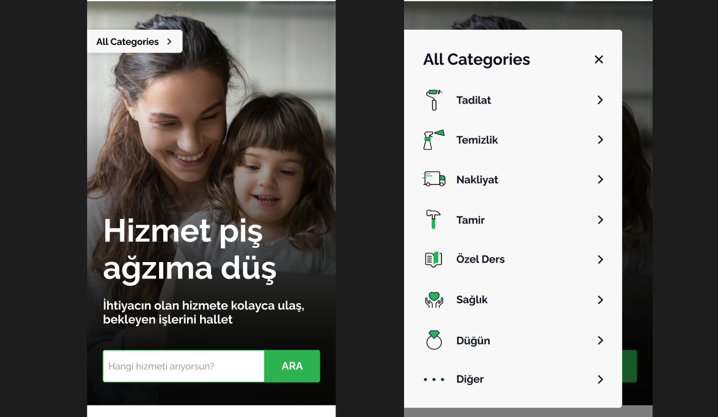
As you can see, in this option, we did prevent blocking the page with a buttons list by putting them in a sticky model. Also, it enables users to reach categories and services wherever they are in our homepage. But it’s such an unusual way to display a bunch of content and it actually hides them from users. Plus, it doesn’t have a desktop equivalent. To explain, of course we could have designed a sticky for desktop too, but we have a lot of space to use in desktop. In short, contrary to mobile, we choose not to do such a thing and hide content in a little label for desktop.
Consistency among our products is one of the main concerns we consider while we’re designing. In that project, we tried to not break the consistency, as always.
In that way, in two different design variants down below, we could manage to create a proper and smooth experience for users. Both have a clear navigation to find the desired service, and both are adaptable for mobile and desktop. At that point, different UI choices would produce different results, so we decided to test them next to our current page.
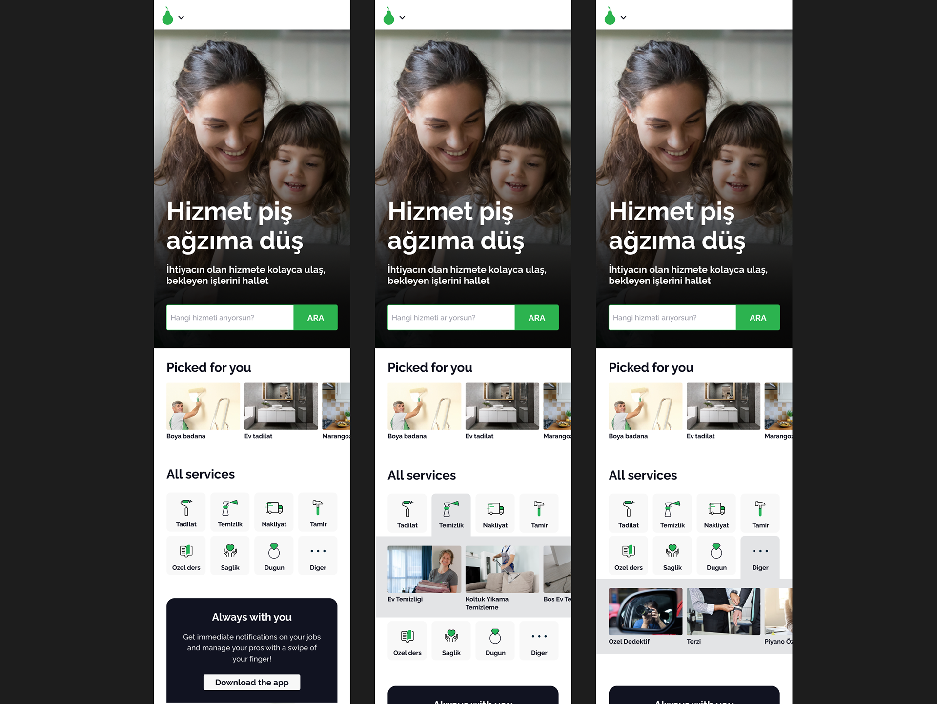
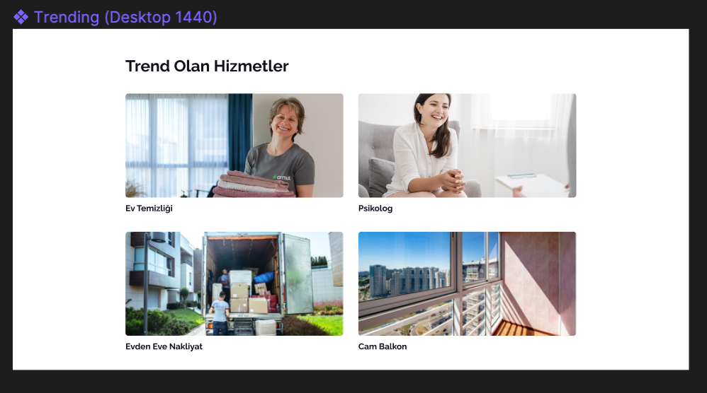
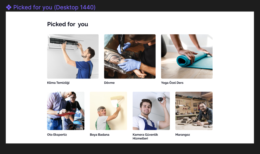
These were all about ‘service discovery’ part of our product. But we have two other contents in our homepage. One of them is “Trending”, which is a list of services popular recently; and the other one is a “Picked for you” list that shows services related to users’ last activity. After re-designing service discovery, maybe they shouldn’t have stayed in the same tiring scroll rows, either. To add some dynamism and take attention, we’d go with bigger pictures and asymmetric layout. Of course, we’ll not change it at a stroke and test them with all other changes besides the already existing design.
The next step was making all these pages responsive. To do that, we had to define constraints for each design. In Figma, it’s really easy to do that but understanding each option thoroughly is a need. There’s no strict rule of this. It’s totally up to the designer’s desired interaction when users resize their pages.
We designed our pages accounting for five different screen sizes. Mobile (Width:375), tablet (W:768) and three desktop sizes (W:1024/1440/1920). We used the “Breakpoints” Figma plug-in to mock and preview the responsive experience across the different screen types.
While we are happy and confident with our process and solutions, these ideas will need to be validated through proper testing before shipping them to the entirety of our users. We’re looking forward to see the results of these tests to update this article and share the impact of our work.